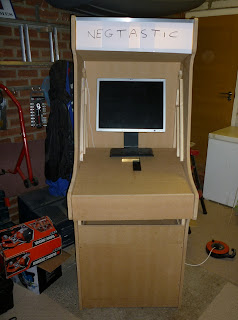
Day 19 - Colours and Problems
I finished priming everything, so that's two coats on every panel. Well, when I say finished I mean I'm not finished. For the visible parts (side panel, kick-board) I'm planning on a third coat, which should be done tonight. After which, I think the 1 litre paint will be completely used up.After wet and dry sanding the second coat of the second side panel I hit a big problem (but just on the second side panel). The MDF was not smooth at all and had scratch lines and wood chips sticking out in small lumps all over the cabinet. But worse was you could see slight bumps in the MDF (no protrusion) where the screws had pushed out the MDF from the inside.
The odd thing is the screws are 35mm, the MDF is 18mm and the batons are 18mm. The screws are flush meaning they should be 1mm below the surface. My first though was I'd screwed it in too far but on the first cabinet there are no faults and the screws are the same. My second though was there was something up with the MDF (e.g. thinner and a failed QA). But I'm sure it wasn't like that.
On checking this morning it looks ok again (I think, I need to check again), so my thought now is the water in the wet and dry or the water in the primer/undercoat lifted the surface until it dried hence the stray MDF clumps and water penetration where the screws are.
Anyway, back to colours.

 Originally back in the beginning the poll showed red was the preferred colour for the cabinet sides. Then after looking at colours I decided upon vermillion (a kind of orange with a red tint, i.e. not orange).
Reading a bike magazine I saw a review of the new Sukuki Gladius whose colour was described as 'retro' and a replica of the Barry Sheene bike of the 1970's. And I think it was just perfect.
 When I say perfect, it's more like an 'international orange' than vermillion. Below is the original bike it was based on, which was slightly redder.
Anyway, you can see that as well as being nicely retro the colour scheme is very nice. My cabinet is already black (with chrome) so, depending on whether my artist friends has time to complete the art work and his direction I think vermillion, white, yellow and black is a very nice set of colours.

This could show best on the control panel, e.g. yellow or vermillion joystick tops, vermillion buttons with yellow surround and white player 1/2 coins.
Thin stripes around the outside edge of the sides would be very retro indeed :)
The conclusion to all of this was a mock-up of the cabinet using the colour scheme above and the space invader monster. Placement was done with the expert advice of snooker wizard Jamie from work and my cheese pasty loving mate Calla. The font is irrelevant. Click to zoom.
Finally, another one from Calla adding some depth to the scene with the monster stepping out of the cabinet. I think I like this one, but the font needs to change...


